IbizaPocholo
NeoGAFs Kent Brockman
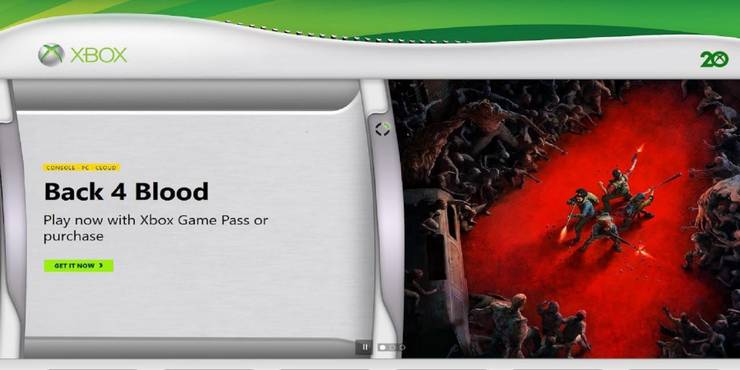
Xbox Website Changes Design to Look Like Xbox 360 'Blades' Dashboard
Xbox celebrates one of its early consoles as the Xbox 360 'Blades' dashboard design is featured on the main page of the Xbox website.
 gamerant.com
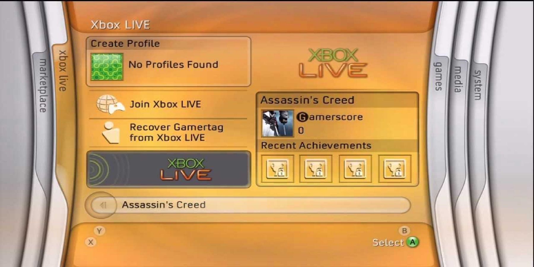
The Xbox website has returned to the Xbox 360 era with a home page that resembles the original dashboard for the seventh generation console and second Microsoft console. This dashboard is known as the "Blades" design and it launched with the Xbox 360 and remained the user interface for the platform until 2011 when it was revamped as part of the new Xbox experience. Xbox 360 fans who were introduced to the platform with the Xbox 360 Slim may not have come across the Blades dashboard, but others are flooded with memories simply by seeing it.
The Xbox home page flips from one page to another similar to the Xbox 360 UI using the Blades dashboard design. The revamped page currently features titles like Back 4 Blood, Far Cry 6, and Nickelodeon All-Star Brawl within Blades of their own, while small text bubbles take Xbox fans to the Game Pass, games, consoles, accessories, play, and sign-in pages. Taking these links will remove the Blades dashboard aesthetic in favor of the modern Xbox website design, suggesting that the Xbox 360 facelift was customized specifically for the home page.