The Infectious Paradox
Gold Member
Gotta be some bad ones out there.


wait you state the bottom one as good UI?I remember Horizon: Zero Dawn having the worst inventory I've ever interacted with. Does that count?
If not, any modern game which UI is just white lines could qualify, there are tons of those. Just compare those two:
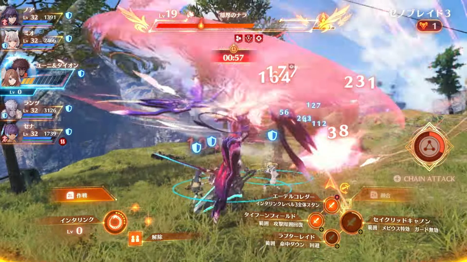
Bad UI. No personality and it looks dull. Just some white lines, fog and 2 models thrown in there:
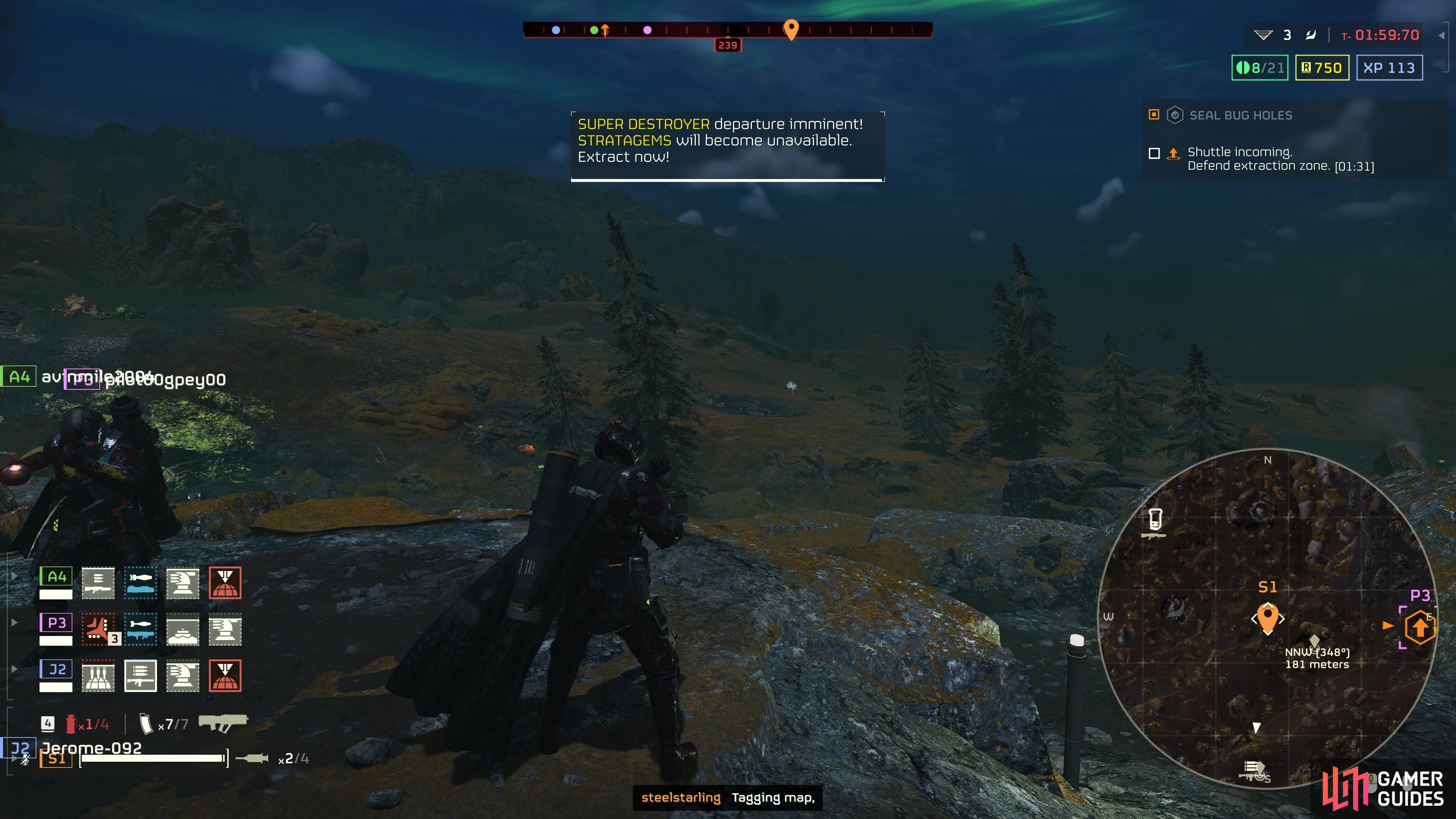
Good UI, design matches the setting of the game and it also looks beautiful.
Edit: Skyrim's UI is fucking bad.

Yes, it displays all the important info and it has charm. What problem do you see in that UI?wait you state the bottom one as good UI?
holy fucking shit man XD
This gets my vote for anything recent.scrolling through the 200 items in a single line to find the one you want to fuse in Zelda was pretty bad.
it only looks so bad because of all the shit added to it.Shit like this needs to go.
Yes, it displays all the important info and it has charm. What problem do you see in that UI?

Gotta be some bad ones out there.
Yeah true but as a HUD it still sucks. First thing I do when starting a game is to see if the HUD can be disabled. Horizon even though the game sucks let's you disable the HUD entirely and just swipe the touch pad and the HUD shows up for a few seconds that's how it should be done.it only looks so bad because of all the shit added to it.
and you can disable pretty much everything. choice is good.
Dude, it's a complex RPG so of couse it has a lot of stuff.yeah i really don't see how this fucking mess is good UI. left and right far side never both in picture (besides UWS users) Top shows 6 pages. then Inventory is also several pages if needed and super clunky. And it needs to scroll up and down with super big boxes. Are you trolling? Because when i booted this game the first thing i tought of was.. holy shit this UI is clunky as hell
loving the game tho but UI ? hell nah

Shit like this needs to go.
Fallout 4 is horrible.
So bad it made me hate the game.

Lol the opposite for me, i had zero problem with horizon inventory but half the times i do something that i don't wanna do in the kc2 inventory.I remember Horizon: Zero Dawn having the worst inventory I've ever interacted with. Does that count?
If not, any modern game which UI is just white lines could qualify, there are tons of those. Just compare those two:
Bad UI. No personality and it looks dull. Just some white lines, fog and 2 models thrown in there:
Good UI, design matches the setting of the game and it also looks beautiful.
Edit: Skyrim's UI is fucking bad.
Din din din din.scrolling through the 200 items in a single line to find the one you want to fuse in Zelda was pretty bad.
nah UI was always clunky as fuck.Sorry guys but I’d have to say almost every FromSoft game ever… the UI is an unintuitive disaster.
I guess this thread is about HUD, but I just had to say that as a gamer and a pro UX-er I'm in love with kcd2s UI. Not necessarily the UX per se (which always could be better), but the aesthetics and organic look & feel is fucking amazing. Nostalgic feels is off the chart also. Symbology/iconography and typography is great as well. I love details like the hare feedback animation in the HUD.I remember Horizon: Zero Dawn having the worst inventory I've ever interacted with. Does that count?
If not, any modern game which UI is just white lines could qualify, there are tons of those. Just compare those two:
Bad UI. No personality and it looks dull. Just some white lines, fog and 2 models thrown in there:
Good UI, design matches the setting of the game and it also looks beautiful.
Edit: Skyrim's UI is fucking bad.
I mean… functionality, accessibility, information flow and clarity are the most important parts of design here. GOW seems straightforward even if its aesthetic is tame.I remember Horizon: Zero Dawn having the worst inventory I've ever interacted with. Does that count?
If not, any modern game which UI is just white lines could qualify, there are tons of those. Just compare those two:
Bad UI. No personality and it looks dull. Just some white lines, fog and 2 models thrown in there:
Good UI, design matches the setting of the game and it also looks beautiful.
Edit: Skyrim's UI is fucking bad.
The shitty part about FF16 is that they said they totally redesigned it after feedback from the reveal trailer, but decided not to use it because "it looked too sci-fi, clashing with the game's setting"
The first game did it better. I don't know why you have to push to the left or right to get more details. Before you just hit r3 i think (or another button and it would flip a pop-up with stats and details (the stuff that now shows on the left or right). I will say this menu does load faster though, but that may just be the ps5 ssd.yeah i really don't see how this fucking mess is good UI. left and right far side never both in picture (besides UWS users) Top shows 6 pages. then Inventory is also several pages if needed and super clunky. And it needs to scroll up and down with super big boxes. Are you trolling? Because when i booted this game the first thing i tought of was.. holy shit this UI is clunky as hell
loving the game tho but UI ? hell nah
dont make me post all of em'
The one you are calling "better" looks messy and cluttered. There is just too much there and one can easily dismiss the bottom one like you did the above one... and I would argue GOW's UI does match the aesthetic of the game world. The character's in the inventory screen don't need to look like a mannequin behind a display, like the one in the UI you prefer lol.I remember Horizon: Zero Dawn having the worst inventory I've ever interacted with. Does that count?
If not, any modern game which UI is just white lines could qualify, there are tons of those. Just compare those two:
Bad UI. No personality and it looks dull. Just some white lines, fog and 2 models thrown in there:
Good UI, design matches the setting of the game and it also looks beautiful.
Edit: Skyrim's UI is fucking bad.
One can learn how to use something, that does not necessarily mean the UI has no problems. There are ways they could have streamlined what they are showing and even if they were to do that, you'd initially take issue with it because how USE to this you've gotten.Dude, it's a complex RPG so of couse it has a lot of stuff.
But I think it's presented well enough. I've had no problems with it in 50 hours of playtime.
I dont get the BL3 hate. One screen for missions, one screen for map, one screen for your items, one screen for skills, one screen for the bonus prestige-like points, one screen for daily challenges, one screen for mayhem mode, one screen for the special modifiers such as the valentines day one or Halloween, one screen for socials, one screen for putting in redemption codes, one screen... yeah ok, I get it.Also on topic.. there are lot of games with bad HUD like the first Dead Island and Borderlands 3 for example... thankfully you can turn off most of it.

I hate this garbage. I try to minimize as much of the HUD as possible while also giving me directions towards missions etc.Shit like this needs to go.