• Hey, guest user. Hope you're enjoying NeoGAF! Have you considered registering for an account? Come join us and add your take to the daily discourse.

The worst HUD design you've ever seen

Spiral1407

Member
Pretty much any MMO

Divinity 2 (Xbox 360)
The game was originally released in early 2009. During development, plenty of PC and Xbox gamers were still using 4:3 displays. For final release, they neglected to respace the HUD elements in the Xbox version for 16:9 displays. They didn't even fix it for the slight remaster that came out more than a year later with engine upgrades and expanded content. Just the same old HUD 4:3 positioning in the middle of the screen.

7Z5GmpM.jpeg


(Absolutely awesome game, btw)
That pic reminds me of Magus. Anyone remember that trainwreck?
 
Last edited:

Jinzo Prime

Member
scrolling through the 200 items in a single line to find the one you want to fuse in Zelda was pretty bad.
Believe it or not, the devs knew it was bad, but they wanted you to scroll through everything so you would be frustrated enough to come up with a unique solution to a problem. Mark Brown talks about it:


You have no idea how much I want to actually play that!
 
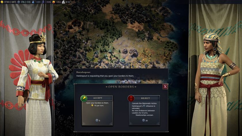
Civ 7, - its not intuitive, and missing so much. Its bear bones. Going into the speerate screens feels like its missing labels and context. There is limited help no mouse overs, like it was designed for consoles instead of pc (because it was, first civ to do this) . Also the side new info board on the right doesn't update it gives the same info over and over. How many times do I need to know that Trung Track (don't even know who she is) has taken over Carthage?


civ-7-sparta.jpg


Here is the diplomacy screen:
It doesn't give you many options, normally there are 3 options, spend influence and both get something, don't spend influence but let the other person go a head and they make out or reject and loose repulation. There is no other options when being, what feels like extorted. It's very limiting. The city states menu is too.

pzbvtfZNYy6V58R5SH9eVh-840-80.jpg


Here is civ 6 for comparison:
Way more info, better looking ui with borders, and mouse overs.

84DAD8962236FBF15524CA222B8DDED2AC8CBA45


Here is civ 5:
Notice again, clear borders and this one had an art deco ui. Way more buttons and information. Look at the recent events on the right, it has details beyond a picture.

trying-to-figure-out-how-i-have-this-ui-set-up-in-civ-5-v0-szfkoourpyeb1.jpg


Civ 4 ui: see the theme.

All continued as this until civ 7.
civ-4-my-first-lvl-10-general-v0-s9enssuf1pz91.png


I won't go into civ 1- 3 as they were not 3d, but even still those games I can still jump in and get up to speed. In fact I just recently did that with civ 2 to see how much it has changed since 1996. Civ 2 has better ui than civ 7.
If we talk aesthetically I actually like Civ 7 more than the previous games. It has kind of a premium look.
It’s just that it doesn’t give enough information right now in some cases.
 

ReyBrujo

Member
I absolutely hate ports to Switch when they keep the original HUD. Games like God Eater 3 got microscopic font. Elite Sniper 3 too, it was so bad I just skipped all the cutscenes since I couldn't read them anyways. The first Wizardry game also had minuscule font but there were far fewer texts. As for design itself, Civilization has always been an easy pick for me, especially the Switch version where everything is smaller.
 
Top Bottom