-
Hey, guest user. Hope you're enjoying NeoGAF! Have you considered registering for an account? Come join us and add your take to the daily discourse.
You are using an out of date browser. It may not display this or other websites correctly.
You should upgrade or use an alternative browser.
You should upgrade or use an alternative browser.
Nintendo Switch game box art
- Thread starter OrbitalBeard
- Start date
Übermatik;228427637 said:This is absolutely, hands-down gorgeous:

Plus the white box is far nicer. Is this the UK version then?
Unfortunately, yes. I mean it's not ugly or anything, but US is obviously a better deal.
Kamina
Golden Boy
This seems to be the European PAL version. I saw this very same image on several online Stores here in Austria.Übermatik;228427637 said:This is absolutely, hands-down gorgeous:
Plus the white box is far nicer. Is this the UK version then?
Jaded Alyx
Member
I wonder if it'll have manuals or just be empty like vita cases
Don't think Nintendo does physical manuals anymore? (I buy digital)
Every game has a digital manual on Wii U though.
Unfortunately, yes. I mean it's not ugly or anything, but US is obviously a better deal.
I agree, they look thematically different. The US version looks more epic, while the EU one is more about discovery and a huge world.
I like the US one better, but the European one is also good.
Re-posting for new page.
Hey peeps look what I found on imgur:

Übermatik;228427637 said:This is absolutely, hands-down gorgeous:
Plus the white box is far nicer. Is this the UK version then?
I really hope they have a reversible cover at least. Both covers look good; US has more of a "ready for adventure and greatness" kind of vibe going for it while EU emphasizes the juxtaposition of casual scale with a "just an adventurer in a massive world" feeling, and I keep flipping between which I love the most.
You don't like the logos? As a European I've always been disappointed in the plain spines we have here.
Nope. I think they're awful, make game shelved look like chaos, and the more complicated ones don't help do the job they're supposed to do: make it quick and easy to know which game is which.
I've always been envious of Japan in that regard.
pinkurocket
Member
The case looks like transparent plastic to me, not white.
Unfortunately, yes. I mean it's not ugly or anything, but US is obviously a better deal.
Do you think so? I prefer this EU version - it has a brighter, more spontaneous vibe to it - and I think that fits the open-world nature of the game perfectly. Both are great, mind!
The case looks like transparent plastic to me, not white.
This is true - guess we'll see!

OrbitalBeard
Member
HOT DAMN!
The Zelda BotW EU cover isn't ugly at all, but I dislike it for several reasons:
- The blurry leaves on the top right corner make it seem like you're looking down from between some tree branches which is a strange angle to go with
- The two swords are way too close together and on top of that their orientation is almost the same
- The way Link is looking back seems awkward
I'd much rather have the US version over here in the EU :/

There's a size comparison on this page.I would like to know the size of it
Vampirolol
Member
The Zelda BotW EU cover isn't ugly at all, but I dislike it for several reasons:
- The blurry leaves on the top right corner make it seem like you're looking down from between some tree branches which is a strange angle to go with
- The two swords are way too close together and on top of that their orientation is almost the same
- The way Link is looking back seems awkward
I'd much rather have the US version over here in the EU :/
Also, that single tree down there is playing with my ocd. US cover is a million times better.
Jon Carter
Member
I love the MK8 Deluxe one, but now that we know there are no new race tracks, I'll have to pass. Both Zelda covers look gorgeous.
The blurry leaves on the top right corner make it seem like you're looking down from between some tree branches which is a strange angle to go with
Those are birds, not leaves.
Here's the full image:

The Zelda BotW EU cover isn't ugly at all, but I dislike it for several reasons:
- The blurry leaves on the top right corner make it seem like you're looking down from between some tree branches which is a strange angle to go with
I'd much rather have the US version over here in the EU :/
Those aren't leaves, they are birds
Those are birds, not leaves.
Here's the full image:
Those aren't leaves, they are birds
That makes it even worse since it just looks like a shoddy image crop now. I know it isn't because the birds are in different positions in the cover art, but still looks bad...
Despite the use of the cliché orange/blue combo, the US cover just looks so much better composed.
But I do love the Trans-Clear option for the boxes in the EU.

If you gotta dream, dream big.
If you gotta dream, dream big.
Don't do this to me. I just got the 3DS version lol
Hey peeps look what I found on imgur:
Assuming your image and the game case measurements that are floating online are accurate, the Switch cases are almost, if not the same size as the Super Famicom's.
PSP = 99 x 168 mm
SFC = 105 x 180 mm
The Switch case is slightly taller and just a tad wider than the PSP's.
There's a size comparison on this page.
No depth comparison. Would be nice to have the whole dimensions.
Jaded Alyx
Member
If you gotta dream, dream big.
This is what I want.
boiled goose
good with gravy
Differently shaped game cases really add to the shiny new gen feel.

A world of possibilities, Nintendo. A world of possibilities...
SimpleCRIPPLE
Member
A world of possibilities, Nintendo. A world of possibilities...
They could be in such a different position right now in regards to mindshare, had they just had the foresight to announce a few HD remixes w/ online to help justify switch to pay-for-play online.
Really hope we get a sequel to this, first game was awesome!
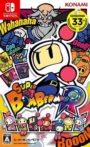
Oh baby, love that Nintendo's continuing the trend of eye-catching boxart. So appealing! Although that Bomberman boxart pales in comparison to Bomberman: Act Zero's.
Lol.
Neverthelesser
Member
Those are birds, not leaves.
Here's the full image:
I wish they were able to scale the image somewhat so that the birds are more clear.
I really don't like the PSP style aspect ratio of the boxes (awkward in many ways, and causes horizontal breathing problems for certain art and logos) and it's baffling they didn't go with red cases; but I am super glad they are the first to get rid of the banner logos for boxes in the West; I was always jealous of Japanese box art not having those big branding banners at the top.
Don't think Nintendo does physical manuals anymore? (I buy digital)
Every game has a digital manual on Wii U though.
I'd stop complaining about paid online if Nintendo would bring back full color paper manuals.
Walked into this thread with only the (now I realize) fake box art and nearly had a heart attack.
seriously, i'm pissed.
That EU Zelda cover is a travesty.
Thankfully Nintendo Australia seems to agree and went with the NA cover.

Also, those clean red spines are fantastic. A shelf of Switch games is gonna be classy.
Noice! Undecided whether I go physical or digital on this one (I like the convenience of Digital but that boxart is too good).
brandonh83
Banned
Peléo;228418024 said:Exactly what I was thinking, it would mesh much better with the Logo. Also stands out more. I loved the Wii-U blue, dissapointed they went with the neutral white with the Switch.
No idea why they didn't make the cases red. It baffles me.
Danny Dudekisser
I paid good money for this Dynex!
Dunno what it is, precisely, but Switch game boxes just make the games look fun. I love how Super Famicom-ish they look. They don't look like DVD or Blu-rays, they look like some video game-ass video games.

I had to after someone mentioned Grand Theft Mario.
The Zelda BotW EU cover isn't ugly at all, but I dislike it for several reasons:
- The blurry leaves on the top right corner make it seem like you're looking down from between some tree branches which is a strange angle to go with
- The two swords are way too close together and on top of that their orientation is almost the same
- The way Link is looking back seems awkward
I'd much rather have the US version over here in the EU :/
The EU cover is super awkward.
bobbychalkers
Member
Oh my god make it real...
Red spine looks boss
Looks like a Prima Guide...
